WedMe App Design

A wedding venue searching app to kickstart planning a wedding providing a complete overview of all steps so that the big day is perfect.

  • UX Design
  • Duration: Oct 2022 to Dec 2022
  • My Role: UX designer (From conception to delivery)
  • Tools: figma, photoshop
The Problem

Busy Professionals were frustrated with the Process of finding a wedding venue and vendors for their big day.

The goal

The Goal is to provide the users with an app that has everything needed to plan a wedding and stay inspired while doing it

My Responsibilities:

Conducting interviews, paper and digital wireframing, low and high-fidelity prototyping, conducting usability studies, accounting for accessibility, and iterating on designs.

Understanding the user

User research: summary

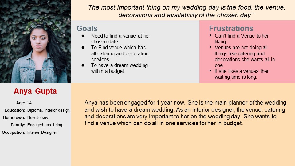
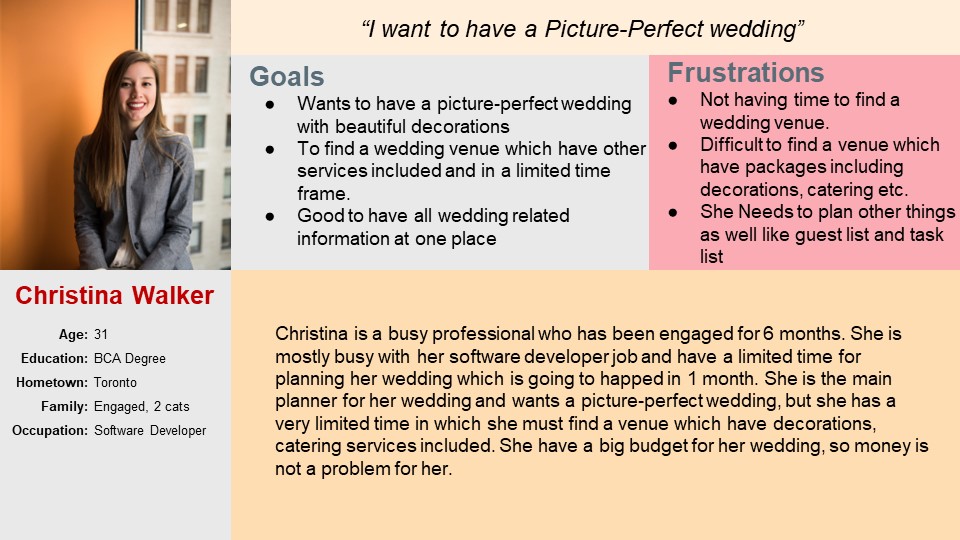
I conducted interviews and created empathy maps to understand the users I’m designing for and their needs. A primary user group identified through research was working adults who don’t have time to search for wedding venues going out. The users are someone who want a dream wedding and can find their desired venues and vendors both at same place and plan a perfect wedding. My research also revealed that Users were facing other problems as well. Along with finding venues they were also looking to find vendors for decorations, cakes, photography etc. It was challenging for them to find all in one place.

pain points:

01

Time

Busy Working adults are too busy to spend time on Finding Venues manually or searching separately.

02

Planning & Organizing

Planning the whole wedding was becoming a tedious task. Considering guest list and vendors etc keeping track of everything was important.

03

Budget

With limited budget it was difficult to know what will come within their budget.

04

Accessibility

Platforms for Venue bookings are not equipped with assistive technologies

persona:
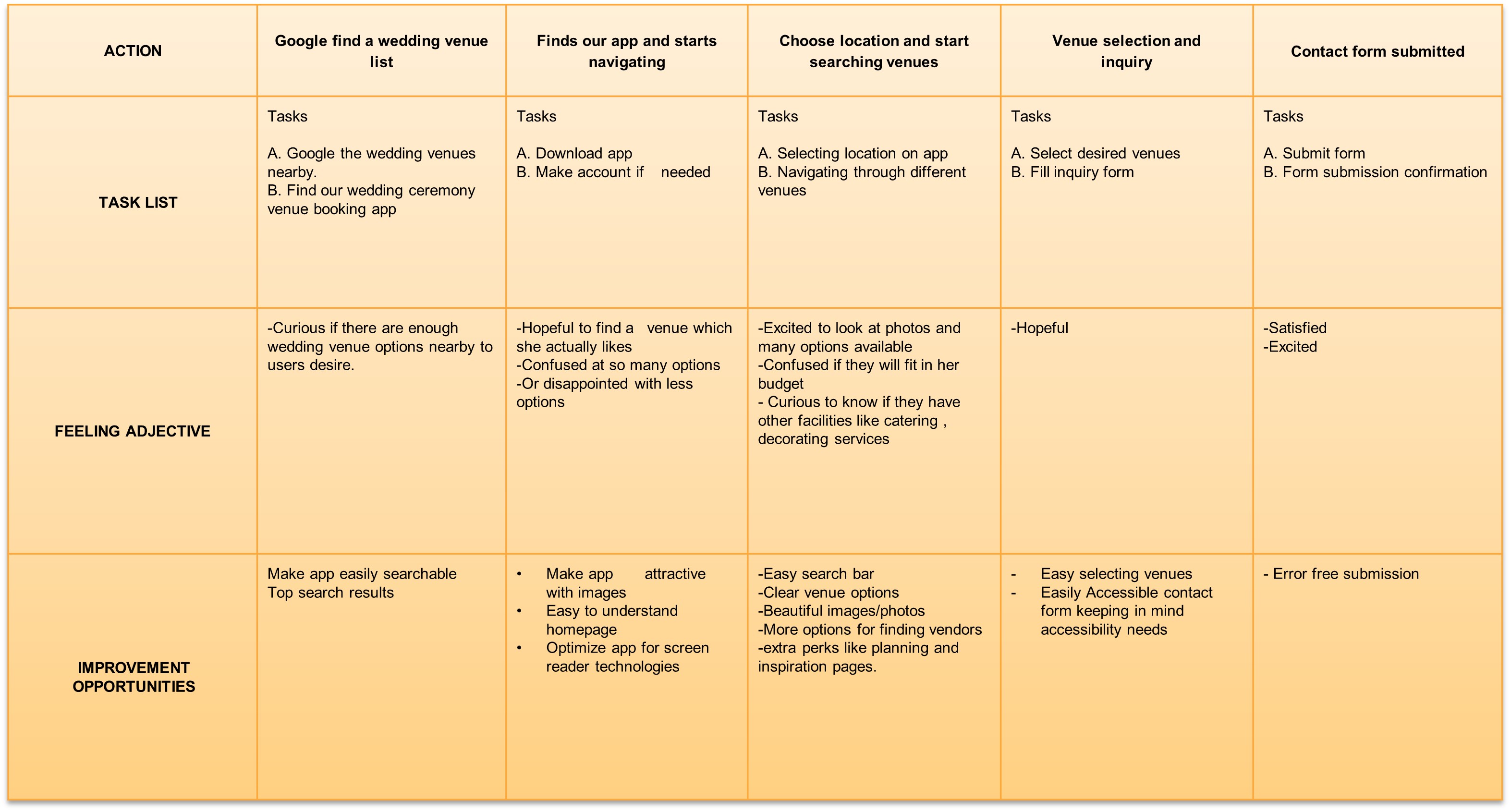
user journey map:

Starting the design

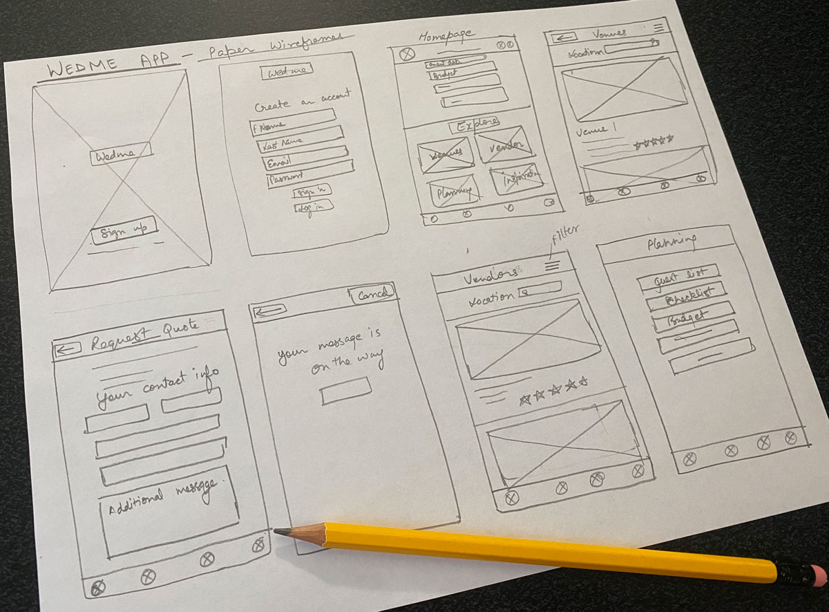
Paper wireframes

Taking the time to draft iterations of each screen of the app on paper ensured that the elements that made it to digital wireframes would be well-suited to address user pain points. For the home screen, I prioritized a quick and easy Search Cards and Process to help users save time.

Digital wireframes

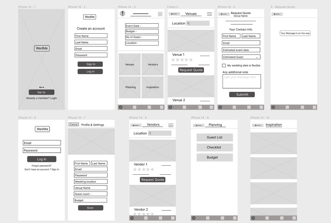
As the initial design phase continued, I made sure to base screen designs on feedback and findings from the user research. Making them easy to use.
I designed the wireframes with the goal to keep the navigation easy and not overcrowd the pages with too much happenings.

Low-fidelity wireframe
Low-fidelity prototype
Usability study: findings

I conducted two rounds of usability studies. Findings from the first study helped guide the designs from wireframes to mockups. The second study used a high-fidelity prototype and revealed what aspects of the mockups needed refining.

  • Round 1 findings
    • Users wanted to see more information about venue and vendors.
    • Most users wanted to see an option to add their contact number as well
    • Users wanted an easy way to back to where they started on each page.
  • Round 2 findings
    • Users wanted to group their favorites under categories like venue, vendors etc

Refining the design

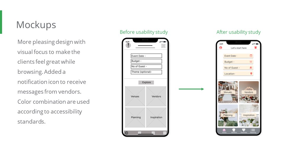
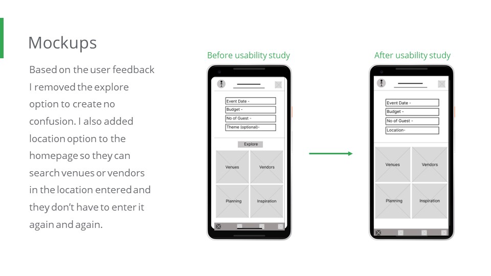
Mockups
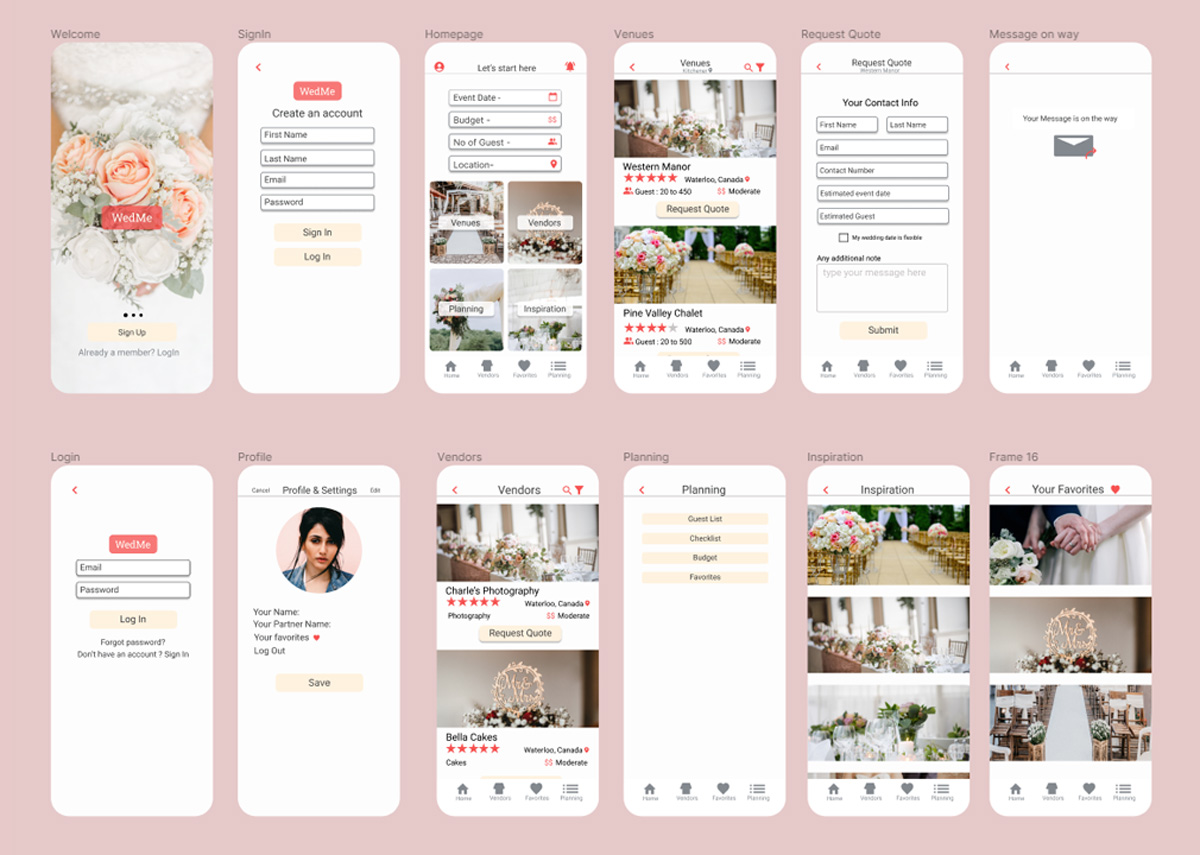
Key-mockups
High-fidelity prototype

The final high-fidelity prototype presented cleaner user flows for searching venues and Contacting them. It also met user needs for having A custom profile to save their favorites.

Accessibility considerations:

01

Provided access to users who are vision impaired through adding alt text to images for screen readers.

02

Used icons to help make navigation easier.

03

Used detailed imagery for Venues and Vendors to help all users better understand the overall look.

Takeaways:

While designing the WedMe app, I learned that the first ideas for the app are only the beginning of the process. Usability studies and peer feedback influenced each iteration of the app’s designs.

I would love to hear about your new project!
Let's talk, share ideas, and collaborate!